Deckstorm – Pinboard Quest Scene
category: UI/UX Design
Deckstorm – Pinboard Quest Scene
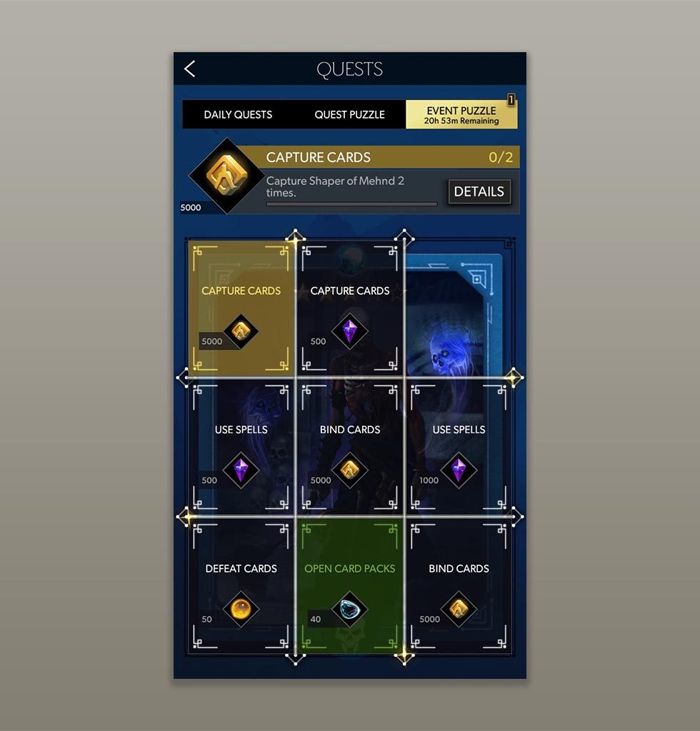
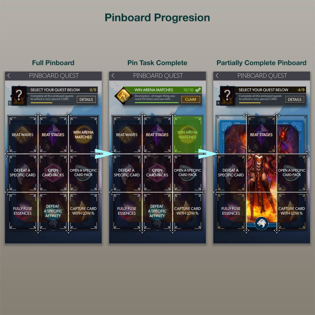
The Pinboard system was a feature designed to increase user participation and retention by offering rewards for the completion of tasks, with a very enticing prize for finishing all of them.
In creating this screen, previous and similar systems from other IP were studied, to determine what were the major cues and callouts that users typically responded well to. As the final reward would be a "rare card", the idea formed that the "pinboard" could be a overlay grid on top of the card, essentially "locking" it from view, and as each individual task was completed, more and more of the board would unlock and the card becomes more visible. Color was important to this, as Yellow in this app denoted a "selected" state so a Yellow pin would mean that is currently selected, therefore Green - the denoted color of positive in the app - would mean a Pin has been completed.
As this system needed to be very enticing and easy for the user to understand, Task names were given priority on the board, though there was also subtle callout to the type of individual reward in each board segment. Further description of the task and reward would be relayed to the user by the dynamic module at the top of the screen. Ultimately this design needed to be encouraging to the user and feel rewarding in and of itself, in order to generate the positive reinforcement of continuing to undertake tasks and thus increase use.
PinboardMovie from Eric Topf on Vimeo.
Task
Design and Implement a positive-reinforcement pinboard UI that is both easy to use and generates excitement through its UX
-
Skills
Unity 3D (UGUI, VFX, Animation), Photoshop, Cacoo Wireframe
-
Employer
DeNA


