Deckstorm – Card Layout and Icons
category: UI/UX Design
Deckstorm – Card Layout and Icons
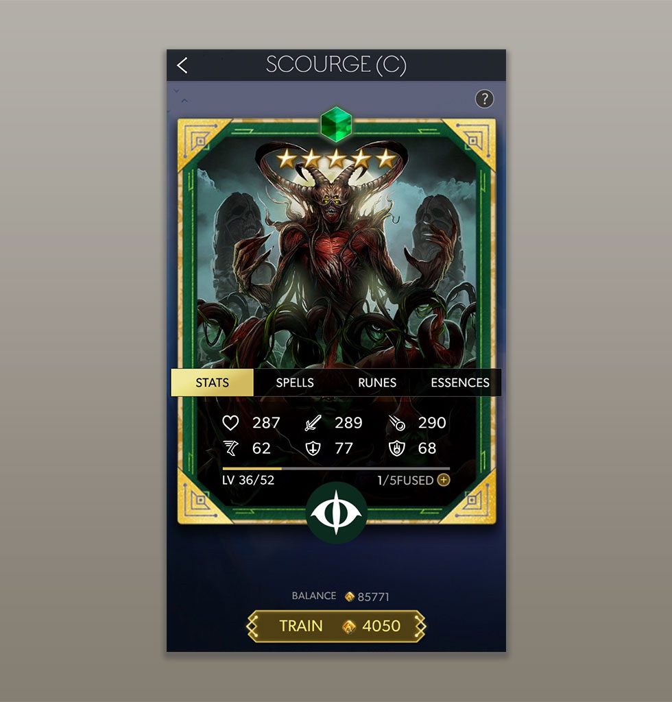
The Cards of Deckstorm are the core of this product, as they are what drive the purchases by the consumer. The Card Artwork and their Stats are the primary factors in what makes them sought after, with the higher and more valuable cards having more well-polished artwork and special stats and attributes.
Card Art and Stats therefore needed to be displayed with the utmost prominence, and doing so without one obscuring or completely overpowering the other. A balance was found through methodical tweaking of the layout where the Stats and their Icons could overlay the card in an area where the Artwork would not be so critical. It was of course imperative that these icons and stats would be visible and understandable on small mobile device screens.
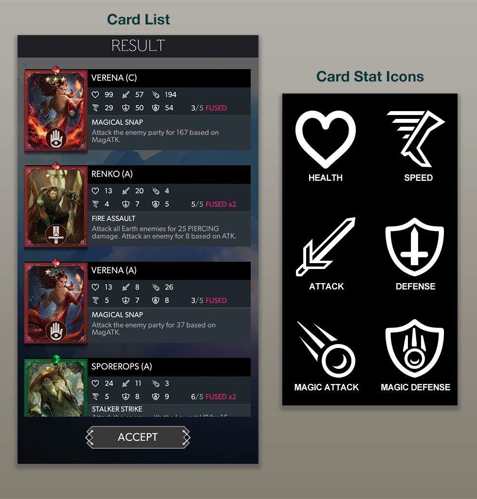
The Icons were created matching the overall "simple" style visual aesthetic of the product, using basic vector line-work to outline a silhouette that would be recognizable in small sizes. Icons were based upon similar visual standards utilized by similar games in terms of conveying their stat, such as a heart for health, or a sword for physical attack.
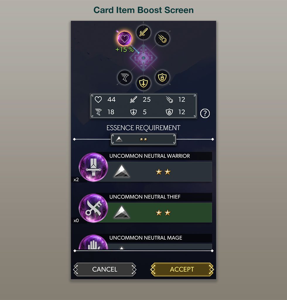
It was also necessary to allow the user to customize their cards further by attaching items to them which would give set boosts to their stats depending on the rarity of the item used. This screen was a challenge to create as one had to give the user enough information to show which stats could be boosted and which items could be used.
When Cards are upgraded, it is a very positive moment for the user. I created an animated cutin to showcase this event, which also needed to showcase the change in stats.
CardEvolveCutin from Eric Topf on Vimeo.
Task
Design and implement Icons for Card Stats and Card Layout information
-
Skills
Unity 3D (UGUI, VFX, Animation), Photoshop, Illustrator
-
Employer
DeNA
