Deckstorm – Deck Creation and Navigation
category: UI/UX Design
Deckstorm – Deck Creation and Navigation
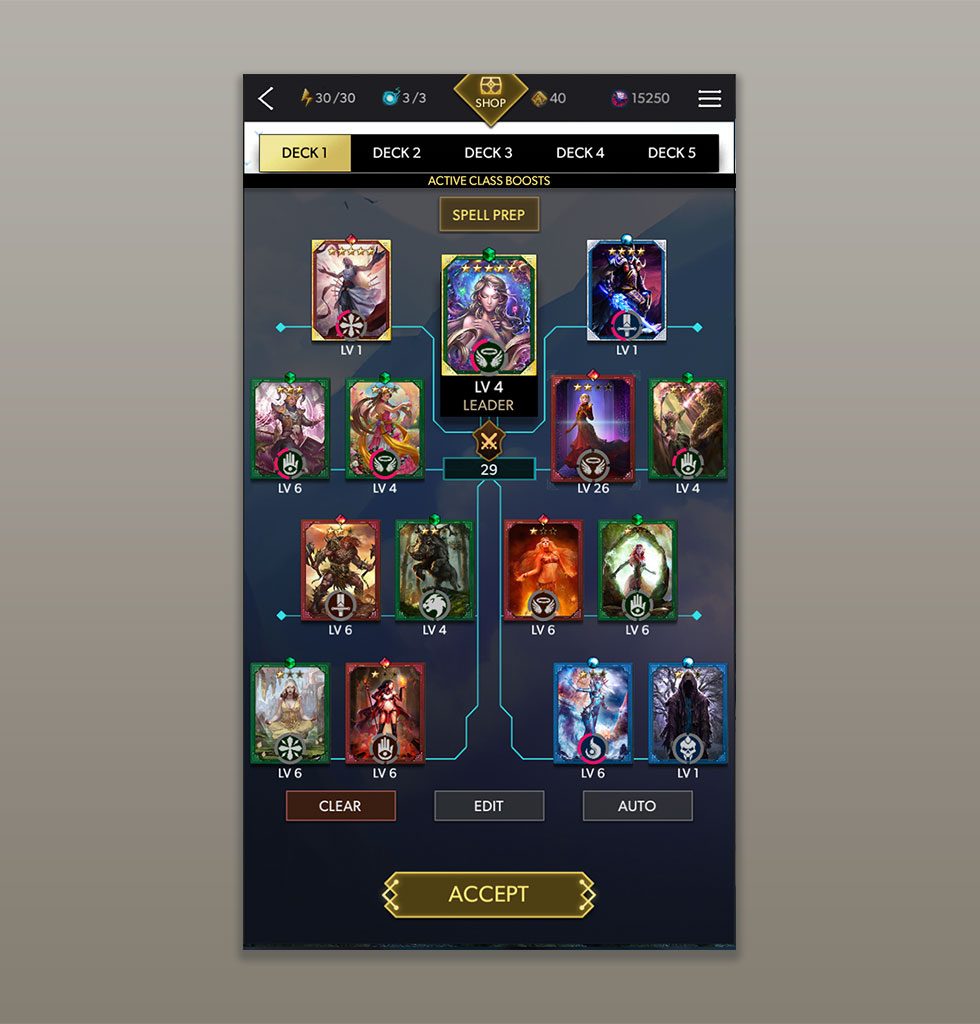
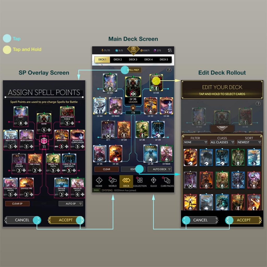
The main deck screen of Deckstorm is the main focal point of the product, where the user would build and manage their "deck of cards" - the avatars used for battle - to play the app. This screen was carefully designed to meet the specified objectives of having a highly reactive and intuitive interface that enabled the user to make quick changes to their deck, and augment the parameters that could be edited for battle.
One primary feature is the ability to drag and drop cards from the Deck to the "Collection" (which was a roll-up menu) and vice-versa by tapping and holding a card. Another feature allowed users to add "points" to their cards to change the flow of gameplay in battle (points charge special skills).
For a detailed write-up on the process for designing this feature. Visit this link: Deckstorm Deck Design
Video of the final product in action:
DeckstormDeckScreenMovie from Eric Topf on Vimeo.
Task
Design and Implement a scalable, reactive and intuitive interface for a user to create, organize and develop their "deck of cards"
-
Skills
Unity 3D (UGUI, VFX, Animation), Photoshop, Cacoo Wireframe
-
Employer
DeNA


